Early influences matter. The first inspirational photography book I ever bought was Himalayan Pilgrimage by Ernst Haas. I remember flicking through the book in a discount bookshop in the East End in the early 1980s. The pictures of life in this far-off part of the world were absolutely entrancing. The strangeness, the beauty and the colour. I had to have it.
Haas was a master, a photographer who could create beautiful photographs wherever he went in the world. Colour was at the centre of his practice, and Kodachrome was his film of choice. When I began my photography journey back in the 1980s, Haas was one of my heroes. If Kodachrome was good enough for him, it was good enough for me.
As time passed, photography became a lesser part of my life; technology changed, and Kodachrome was no longer made. When I returned to photography a few years ago, digital photography was the technology of the day. So I tooled up and got to work.
Photography is a creative process that involves many steps. Deciding to have the camera with you is a step. Being interested in something is another. Making the photograph is yet another; processing and presenting it involve even more choices. These choices are all conscious and important, and they inform the final work. The digital processing of the photograph is comparable to the darkroom work of the analogue photographer. This is where the raw image, literally the RAW file, is transformed into the work that the photographer wants to show to the world.
As I experimented with processing, my thoughts went back to the beautiful colours of my Kodachrome era. Given the endless potential of digital processing, surely I could reclaim the colours and imagery that first inspired me? I’m not alone in thinking this. Plenty of other photographers have the same idea, and it’s easy to find tutorials and presets that help recreate that style of image-making.
When we work with an image, we impose stylistic choices upon it. It would look better lighter, darker, with more saturation, or less. We can wander from one look to another, or we can accept the discipline of a style that we make our own. I am very interested in reclaiming the look of the photographs that inspired me in the 1980s and applying that to the work I create now. All photographs have a look about them, even if that look is the default for digital photography. Better surely to decide what you want, rather than leave the choice to the camera makers.
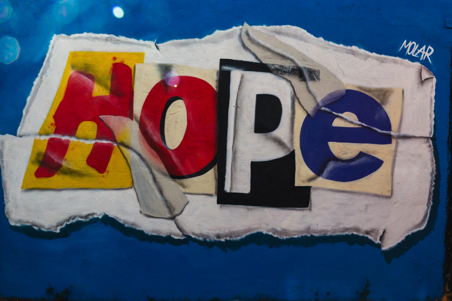
This is a new line of thought for me, and I’m taking the first steps. Recently, I took a trip to Brighton and looked for photographs with strong colour elements. I then processed them in Lightroom with a preset for the Kodachrome look.
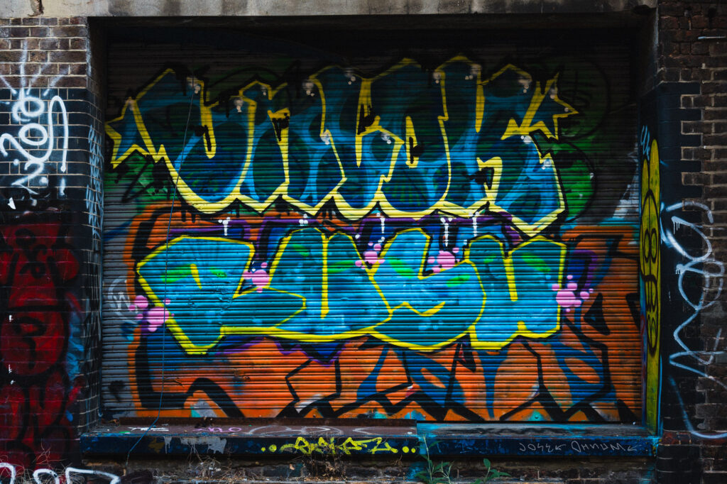
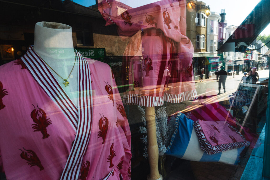

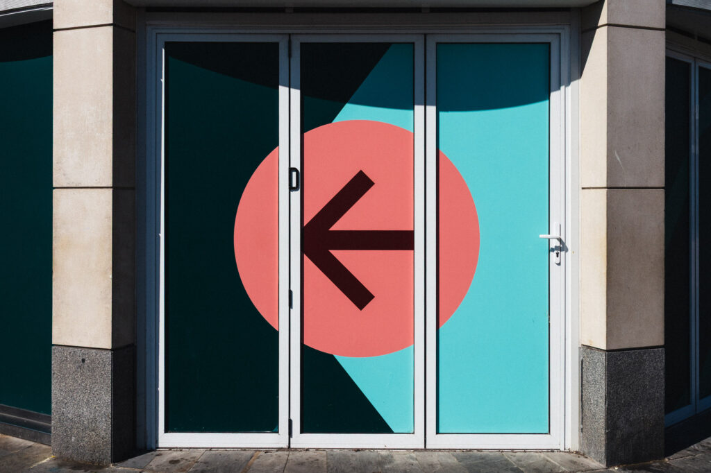
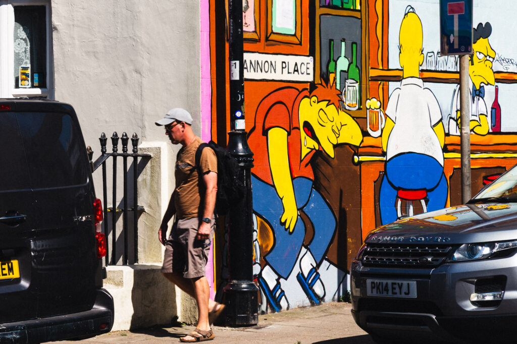
When someone goes out with a camera loaded with slide film like Kodachrome, they accept the discipline of working with that medium. Slide film in the camera, compose, check the light, expose, print. You had to be good to get great results within that tight range of options. Steve McCurry, William Eggleston, and Ernst Haas were great photographers who created the photographs that continue to inspire me. I want to follow this inspiration and take it into new places and a new time. So I will be bringing this aesthetic choice to my photographs, and I shall see where it takes me.
****
You can buy Kodachrome presets for Lightroom or create your own. This is a list of settings to apply to an image to approximate the Kodachrome look. These settings will not work in all situations because there are so many variables involved. Kodachrome responded differently to brightly lit or shaded scenes. Your camera will likewise behave in its own way. Experiment, reflect, tweak, have fun!
Establish the Global Profile & Contrast:
Basic Panel.
- Profile: Switch from Adobe Standard to Adobe Landscape or Camera Vivid to provide a punchier baseline saturation.
- Contrast: Increase slightly (+15 to +25). Kodachrome slides were inherently high-contrast.
- Highlights & Shadows: Drop the Highlights (-20) to keep whites from blowing out, but pull up the Shadows moderately (+15 to +30) to prevent deep blacks from becoming completely muddy while retaining that characteristic slide film latitude.
Dial in the Signature Curves:
Tone Curve Panel.
Lift the deepest blacks slightly to give it a vintage feel, while keeping a strong S-Curve for contrast.
- In the Point Curve, create a subtle S-curve by adding a point in the shadows and pulling down, and a point in the highlights and pulling up.
- Take the absolute bottom-left point (true black) and lift it slightly off the floor. This softens the harshest blacks, giving them a subtle, film-like matte finish without losing contrast.
Shift the Chemical Colour Matrix:
HSL / Colour Mixer Panel.
Kodachrome was famous for vibrant, slightly orange-leaning reds, rich yellows, and deep teal-leaning blues.
- Hue: Shift Red slightly toward Orange (+5). Shift Orange slightly toward Yellow (+4). Shift Yellow toward Green (+5). Shift Blue slightly toward Cyan (-8).
- Saturation: Boost Red (+15) and Yellow (+10). Drop Green (-15) as 1970s Kodachrome greens were notoriously desaturated and earthy. Drop Blue slightly (-5).
- Luminance: Drop Red (-10) and Blue (-12) to make those colours look deep, rich, and dense.
Warm the Tonal Ranges:
Colour Grading Panel.
Kodachrome has an overall warm, golden-hour cast even in daylight.
- Highlights: Add a very subtle warm cream/yellow hue (around Hue: 50, Saturation: 5).
- Shadows: Add a touch of deep teal or dark blue to balance the warmth (around Hue: 215, Saturation: 4). Keep this incredibly subtle so it doesn’t look like a modern cinematic tint.
Add Fine, Sharp Film Grain:
Effects Panel.
Unlike later 1970s print films, Kodachrome was a slow slide film with incredibly tight, sharp grain structure.
- Amount: 15 to 25
- Size: Keep it very small (20 to 25) to match the fine-grained nature of ISO 25/64 film.
- Roughness: Increase slightly (60) to give the grain a crisp, sharp appearance rather than a digital blur.
Calibration:
If your colours still feel too digital, go to the Calibration panel at the very bottom of Lightroom. Try shifting the Red Primary Hue toward orange and boosting its saturation, while shifting the Blue Primary Hue slightly left. This alters the underlying colour mix of the entire sensor data and often provides the final missing piece for a convincing analogue emulation.
How to Create the Preset:
- On Desktop (Mac/Windows): Look at the left-hand sidebar and find the Presets panel. Click the + (Plus) icon at the top right of that panel and select Create Preset.
- On Mobile (iOS/Android): Swipe across the bottom toolbar until you find Presets. Tap it, then tap the three dots in the top-right corner, and choose Create Preset.
Which Boxes to Check (and Uncheck)
When the creation window pops up, you will see a list of checkboxes. Do not just click “Select All.” Leaving certain settings checked will ruin the exposure of your future photos.
Use this checklist to configure it correctly:
| Group | What to Check / Uncheck | Why |
| Treatment & Profile | Check | Keeps the underlying profile (like Adobe Landscape) active. |
| Basic Elements | Uncheck Exposure, Contrast, Highlights, Shadows, Whites, Blacks | Critical: Every photo has different lighting. If you bake in your exposure tweaks, a dark photo might become pitch-black, or a bright photo might become totally blown out. |
| Color | Check Vibrance, Saturation, HSL/Colour Mixer, Colour Grading, Calibration | This saves all of your specific Kodachrome chemical colour shifts. |
| Tone Curve | Check | Saves your custom S-curve and lifted matte blacks. |
| Effects | Check Grain | Saves your tight, sharp 1970s grain settings. |
| Lens Corrections & Transform | Uncheck | These should always be unique to the lens you shot with, not the film style. |
Name your new preset something descriptive (like “1970s Kodachrome 64”) and save it to your “User Presets” group.
Pro Tip:
Once you apply this preset to a new photo, adjust the Exposure and White Balance sliders in the Basic panel to tailor it to that image’s lighting.